
← 返回目录 视觉先祖
1950–1970 年代,1960 年代尤盛。
欧普艺术 Op Art
欧普艺术用精确重复、对比与几何干涉,让静态表面看似在振动、膨胀或移动,这一点在当下仍可被识别。
真实参考
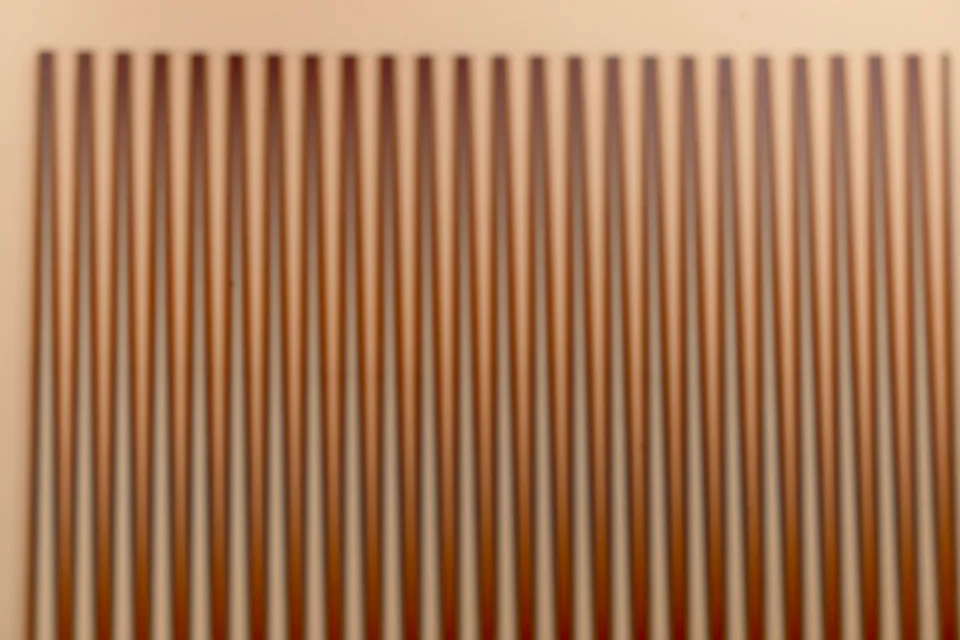
来源与版权:CC BY 2.0
统一场景实验
认识这种风格
欧普艺术用精确控制的对比、重复与几何干涉,在静态表面触发知觉的振动、膨胀或运动。其光学反应依赖被测量的图地关系与一致的图案逻辑,区别于自由手的迷幻装饰。该运动在 1950–1970 年代、尤其是 1960 年代显赫,并随 1965 年的《应答之眼》展览与时尚采纳扩散。
起源
视觉签名
- high-contrast repeated units
- perceptual movement without depicted action
- mathematical control of figure and ground
把这种风格用起来
Use the attached image as the source. Preserve its original subject, composition, and aspect ratio as much as possible.

Apply this visual style: Rebuild the source through controlled optical movement using black-and-white stripes, converging grids, repeated modules, concentric targets, wavy stripe fields, checker interference, vibrating edges, repeated discs, moire, figure-ground reversal, and mechanically consistent screenprinted line spacing. Add only small red, cyan, or yellow accents as controlled disruptions.

Avoid: freehand psychedelic swirls or gradients that lack precise perceptual structure.
更多资料
编辑判断 · 更新于 2026-06-12
调色板
关键词
文化关联
音乐
- minimalism
- electronic pulse music
- psychedelic rock
媒介
- painting
- textile
技术
- screenprinting
- precise drafting
- industrial pigments
事件
- The Responsive Eye exhibition in 1965
- 1960s fashion adoption
常见失败模式
- 没有受控光学响应的图案密度,只是墙纸而非欧普艺术。
关联风格
视觉先祖
风格制作拆解
避免:Avoid freehand psychedelic swirls or gradients that lack precise perceptual structure.
01
主体与环境
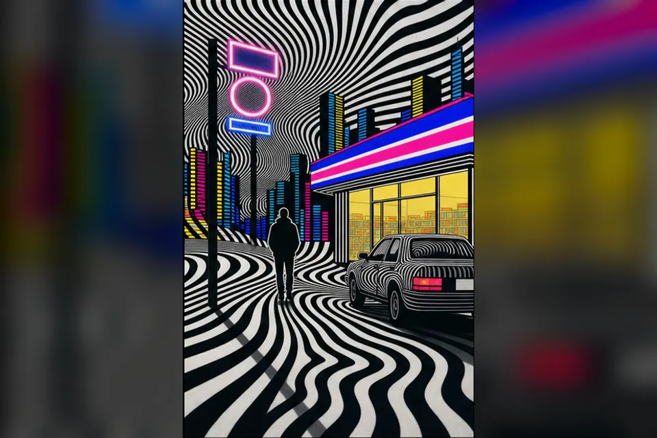
A convenience-store street whose road markings and facade grid create controlled optical movement.
02
构图与视角
Build the street from converging stripes and repeated modules, bending the grid around the figure, car, and store entrance.
03
调色板与光影
Let black and white carry most of the optical load, adding only small red, cyan, or yellow accents as controlled disruptions.
04
媒介与材质
Use flat acrylic or screenprinted lines on a smooth support with mechanically consistent spacing and sharply drafted edges.
05
风格标志物
concentric targets, wavy stripes, checker interference, vibrating edges, and repeated discs
06
后期与效果
Generate moire, wave interference, and figure-ground reversal through repeated units whose spacing bends around the scene.
制作手记
构图原则
Build the street from converging stripes and repeated modules, bending the grid around the figure, car, and store entrance.
材质
- flat acrylic paint
- screenprinted line
- precisely drafted geometry
光线
- graphic black-white contrast
- small saturated accents
效果
- moiré
- figure-ground reversal
- wave interference