
← 返回目录 数字失真
1960 年代至今。
ASCII 字符艺术 ASCII Art
ASCII 艺术用等宽字符阵列构建图像,靠字形的疏密来描述轮廓、明暗与肌理,并保留可读的字符。
真实参考
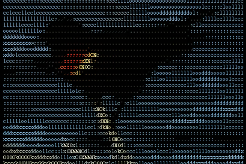
来源与版权:CC BY-SA 3.0
统一场景实验
认识这种风格
ASCII 艺术从固定的等宽字符网格构建图像,用字形形状与密度描述轮廓、明暗与肌理。它的视觉逻辑来自文本模式的约束:每个记号仍是可读的字符,而成行成列的标点、字母与符号又汇聚成更大的图画。该形式从 1960 年代起伴随打字机艺术、行式打印与计算机终端发展,并深入 BBS 与 demoscene 文化。
起源
视觉签名
- images resolved through character density
- strict monospaced grid
- limited glyph and color vocabulary
把这种风格用起来
Use the attached image as the source. Preserve its original subject, composition, and aspect ratio as much as possible.

Apply this visual style: Reconstruct the source entirely from readable monospaced characters on a terminal raster. Use character density to model light and shadow, dense glyph clusters for dark areas, sparse glyphs for highlights, punctuation for texture, and visible rows, columns, cursor spacing, boxed signs, prompt marks, and restrained scanlines. Limit the palette to near-black, phosphor green, and pale terminal highlights.

Avoid: proportional fonts, smooth vector curves, or a photographic image merely covered by random letters.
更多资料
编辑判断 · 更新于 2026-06-12
调色板
关键词
文化关联
音乐
- chiptune
- demoscene music
- tracker music
媒介
- terminal screen
- BBS file
- plain-text signature
技术
- ASCII encoding
- monospace fonts
- bulletin-board systems
事件
- early computer networking
- BBS and demoscene culture
常见失败模式
- 若字形选择不随明暗与轮廓变化,结果只是文字纹理,而非 ASCII 造像。
关联风格
视觉先祖
风格制作拆解
避免:Avoid proportional fonts, smooth vector curves, or a photographic image merely covered by random letters.
01
主体与环境
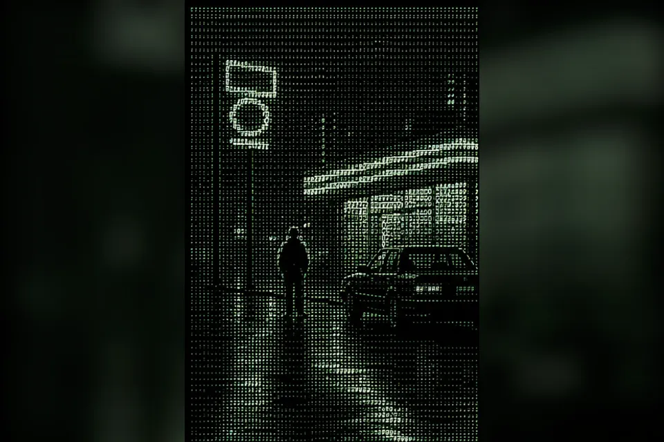
A rainy convenience-store street reconstructed entirely from readable monospaced characters.
02
构图与视角
Reduce the street into large tonal masses, reserving dense glyph clusters for the figure, car, and brightest store lettering.
03
调色板与光影
Limit the display to near-black, phosphor green, and pale terminal highlights, using character density rather than gradients to model light.
04
媒介与材质
Render every form as monospaced plain text on a terminal raster; retain visible rows, columns, cursor spacing, and glyph edges.
05
风格标志物
prompts, cursor blocks, boxed signs, slashes for rain, and punctuation-based reflections
06
后期与效果
Shade with ordered character substitutions, soften the grid with restrained scanlines, and use punctuation directionally for rain and reflections.
制作手记
构图原则
Reduce the street into large tonal masses, reserving dense glyph clusters for the figure, car, and brightest store lettering.
材质
- monospaced glyphs
- terminal raster
- plain-text grid
光线
- green phosphor glow
- high-contrast text luminance
效果
- character-density shading
- ordered text dithering
- scanline softness